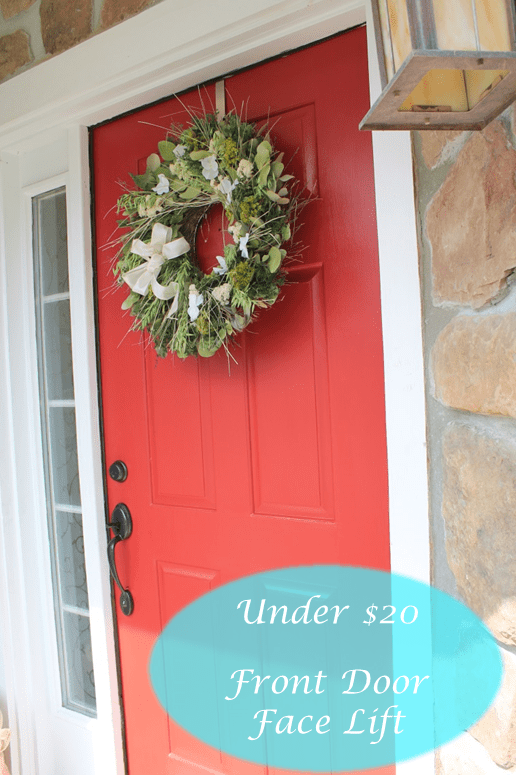
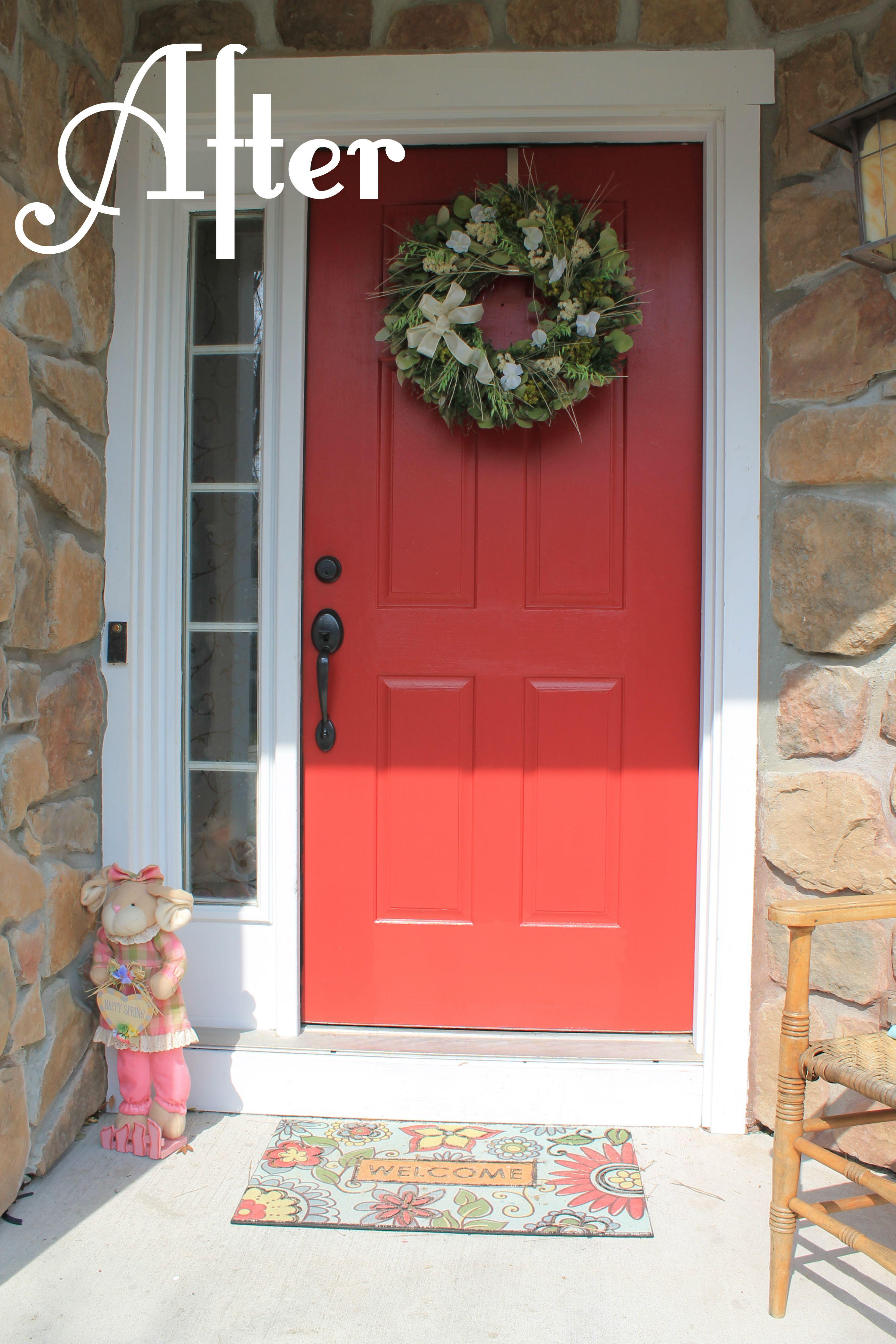
First impressions are extremely important, not only when meeting new people but also with your home. And at home, that impression starts at the front door. Unfortunately, our front door was drab and dreary which is not the tone we wanted to set. Time for a makeover 🙂

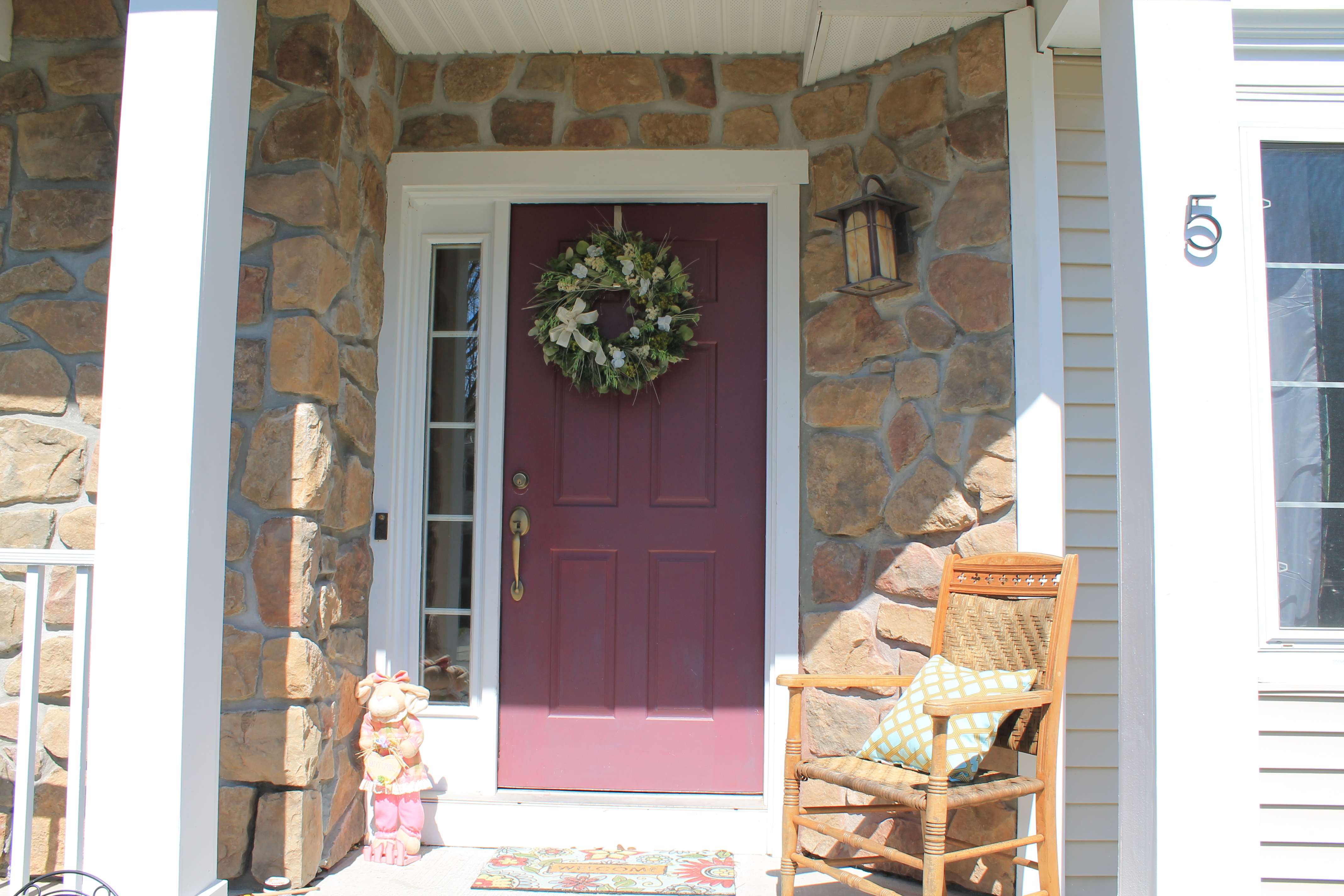
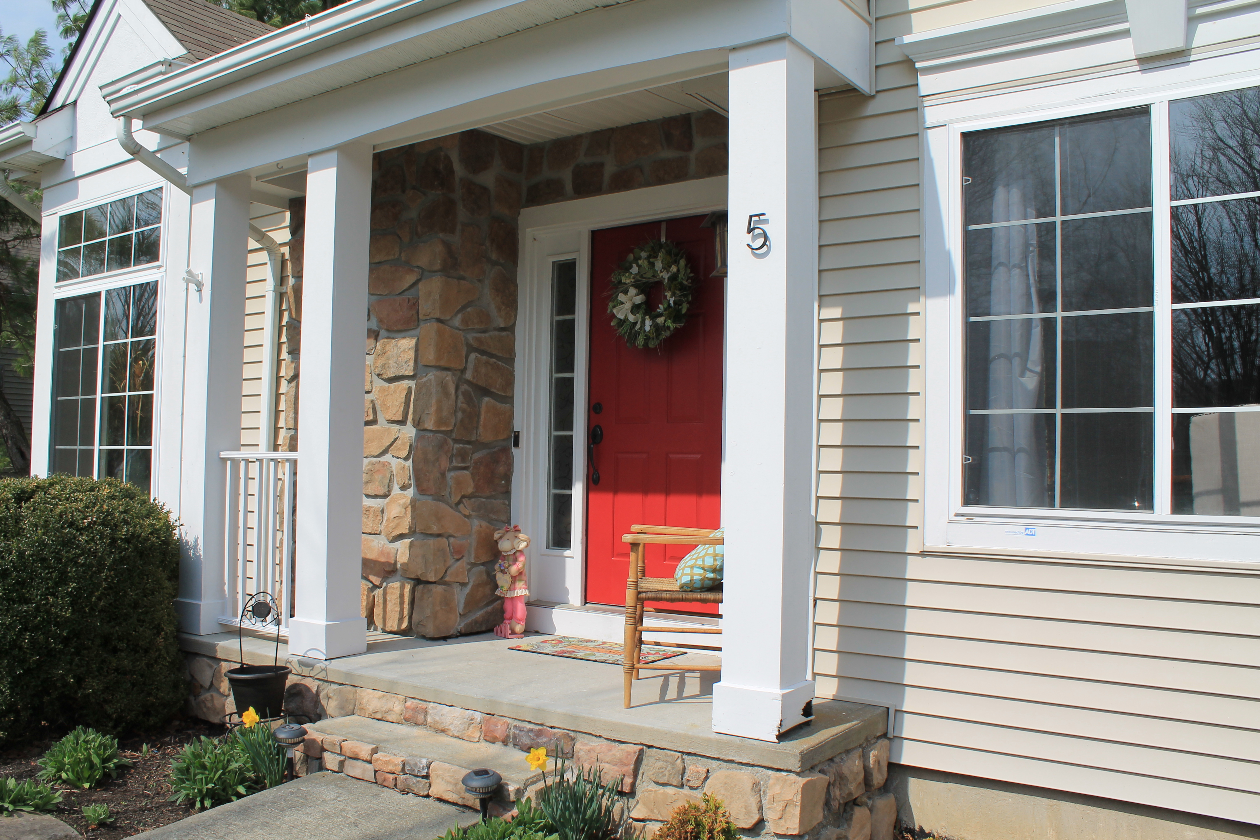
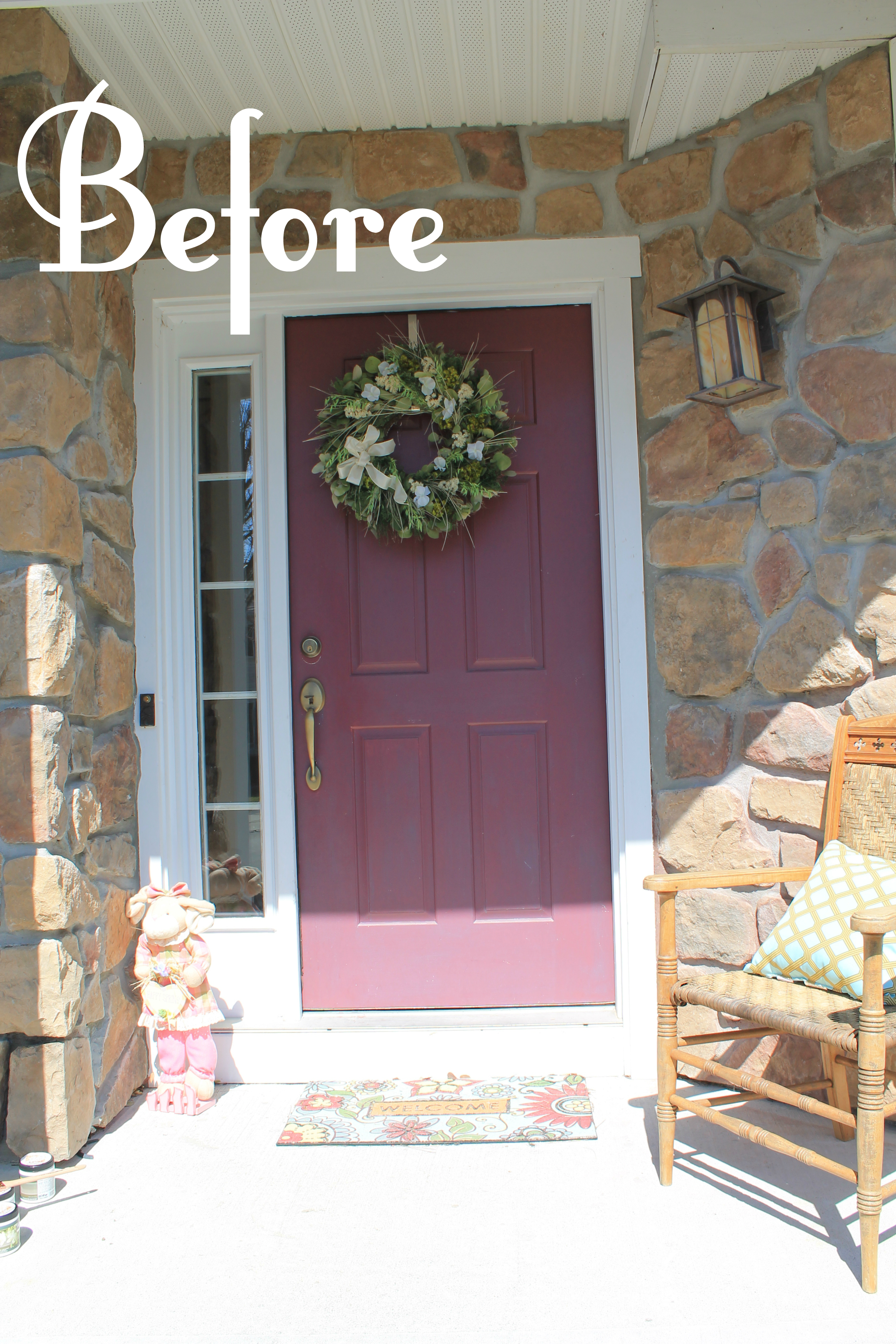
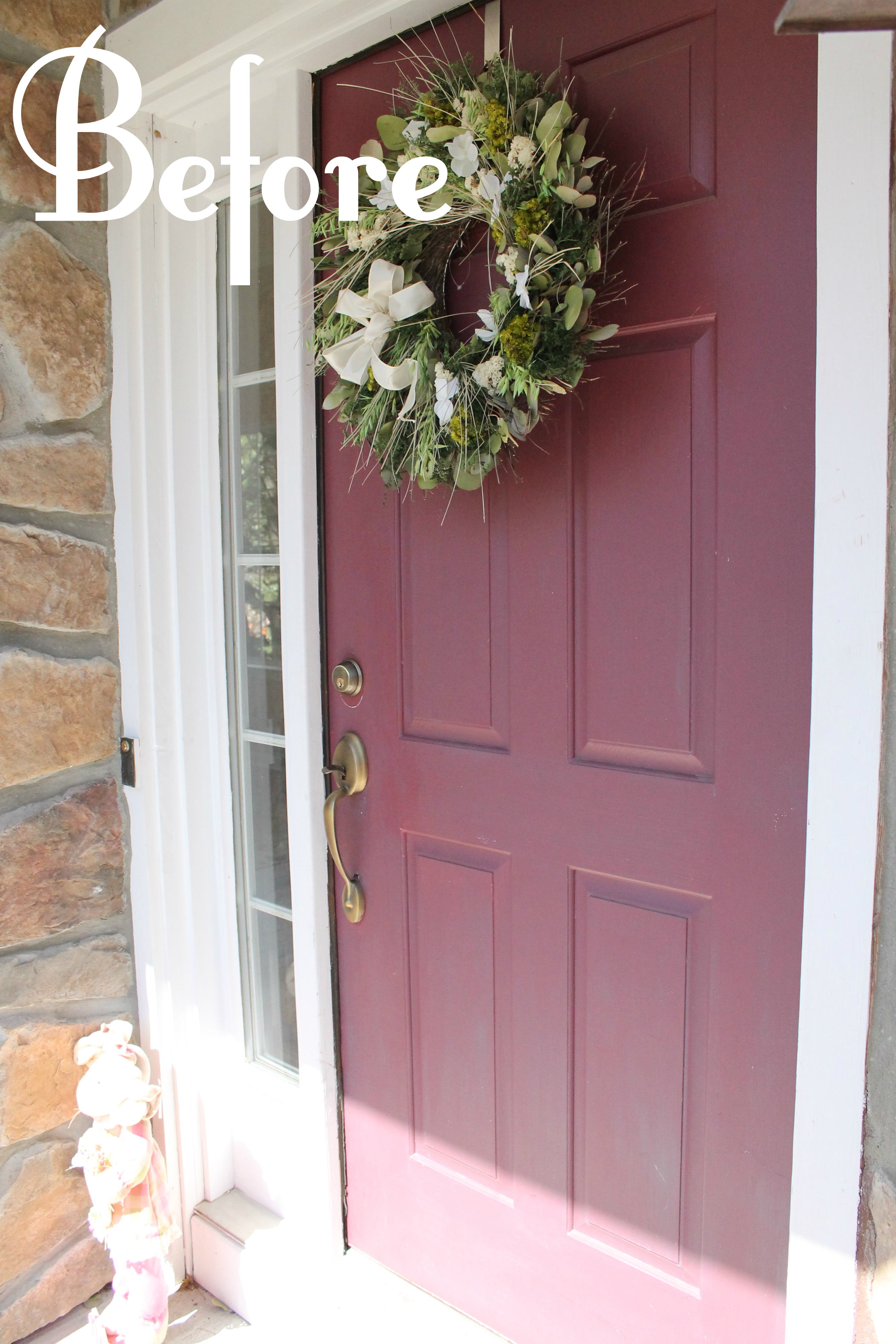
Before, the door was a burgundy/purple color and didn’t do anything for the curb appeal so we decided to spruce it up… and all we needed was a little paint. And now…

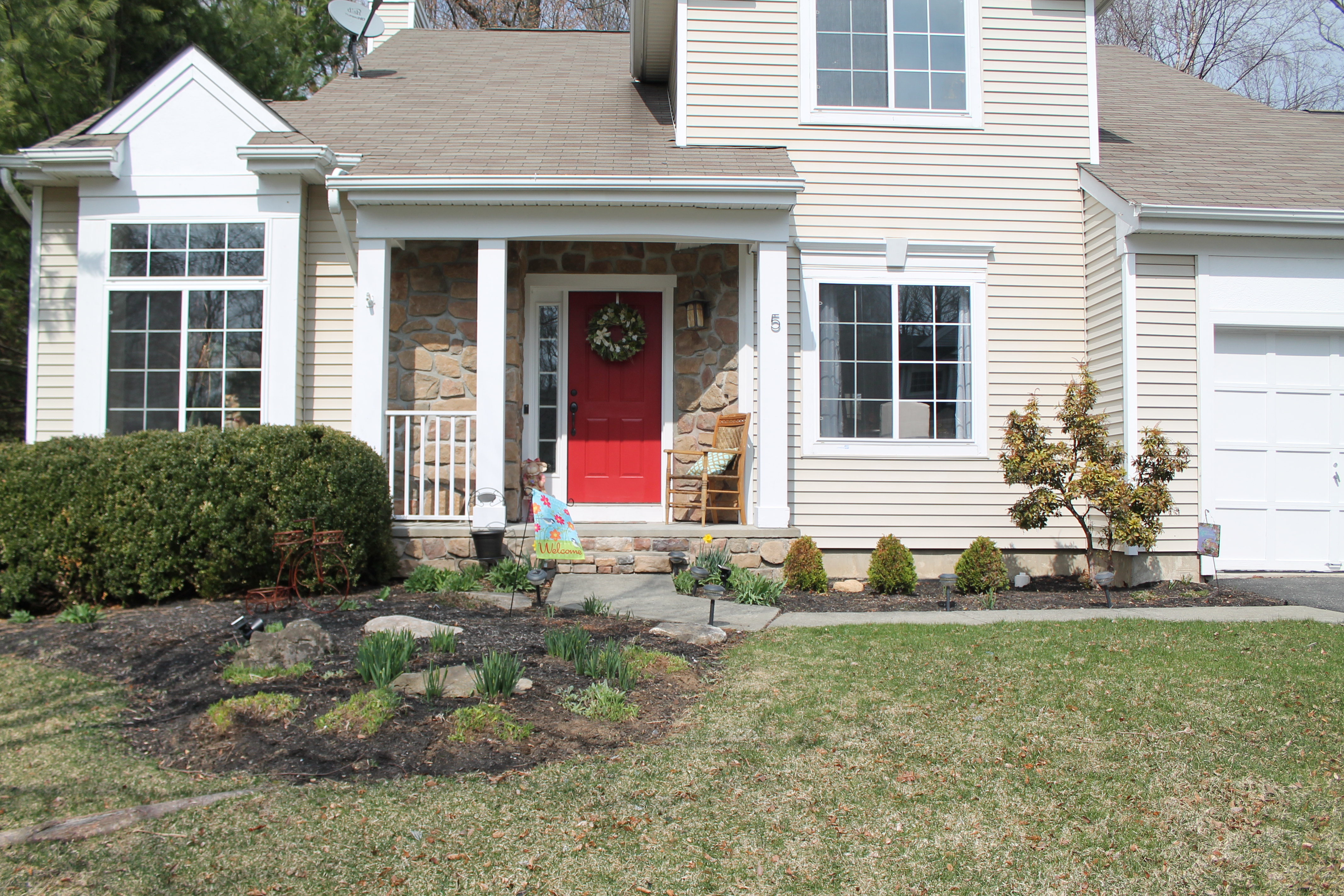
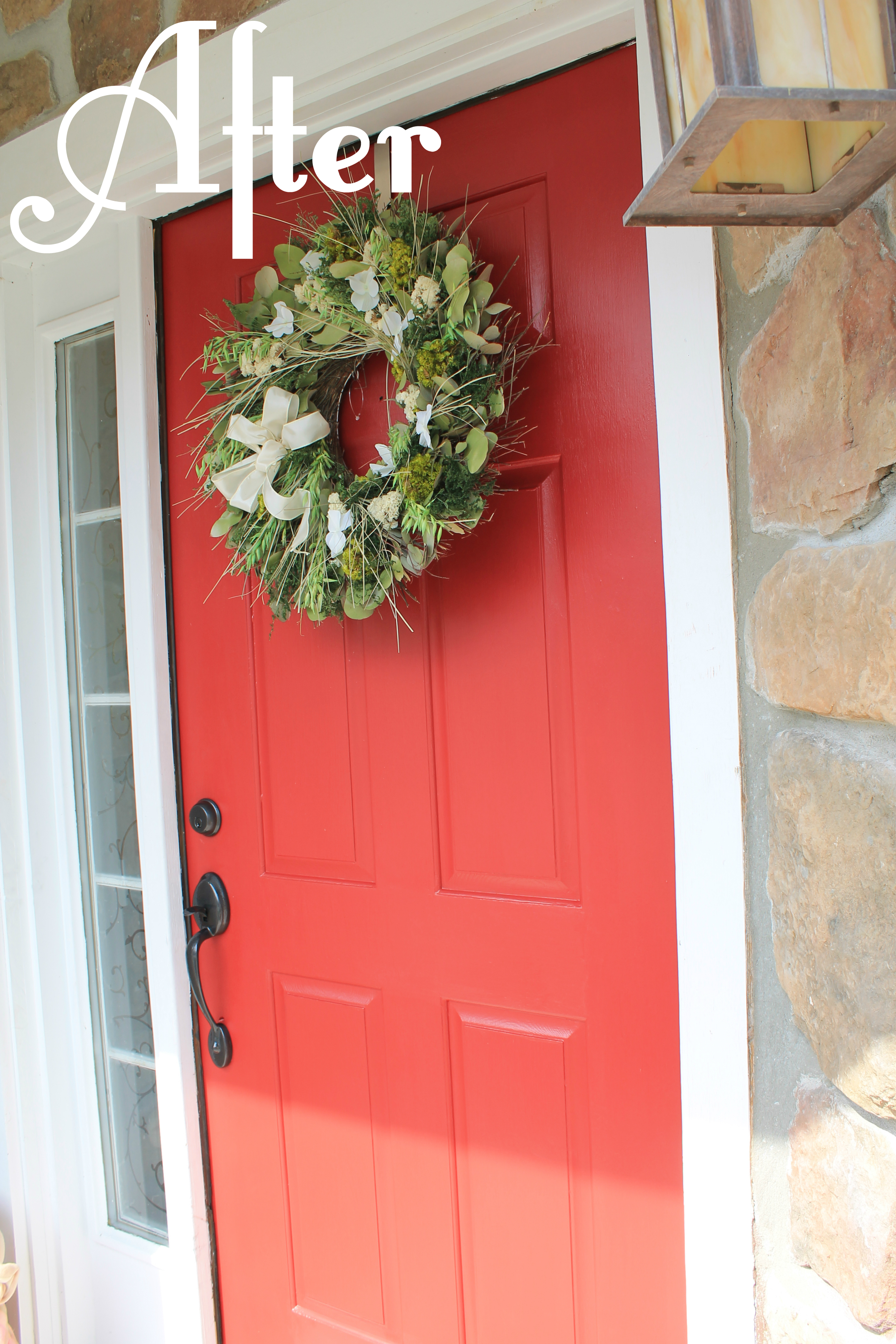
Ahh! There’s nothing more classic than a bright red front door. It’s bold but timeless– the perfect combination.
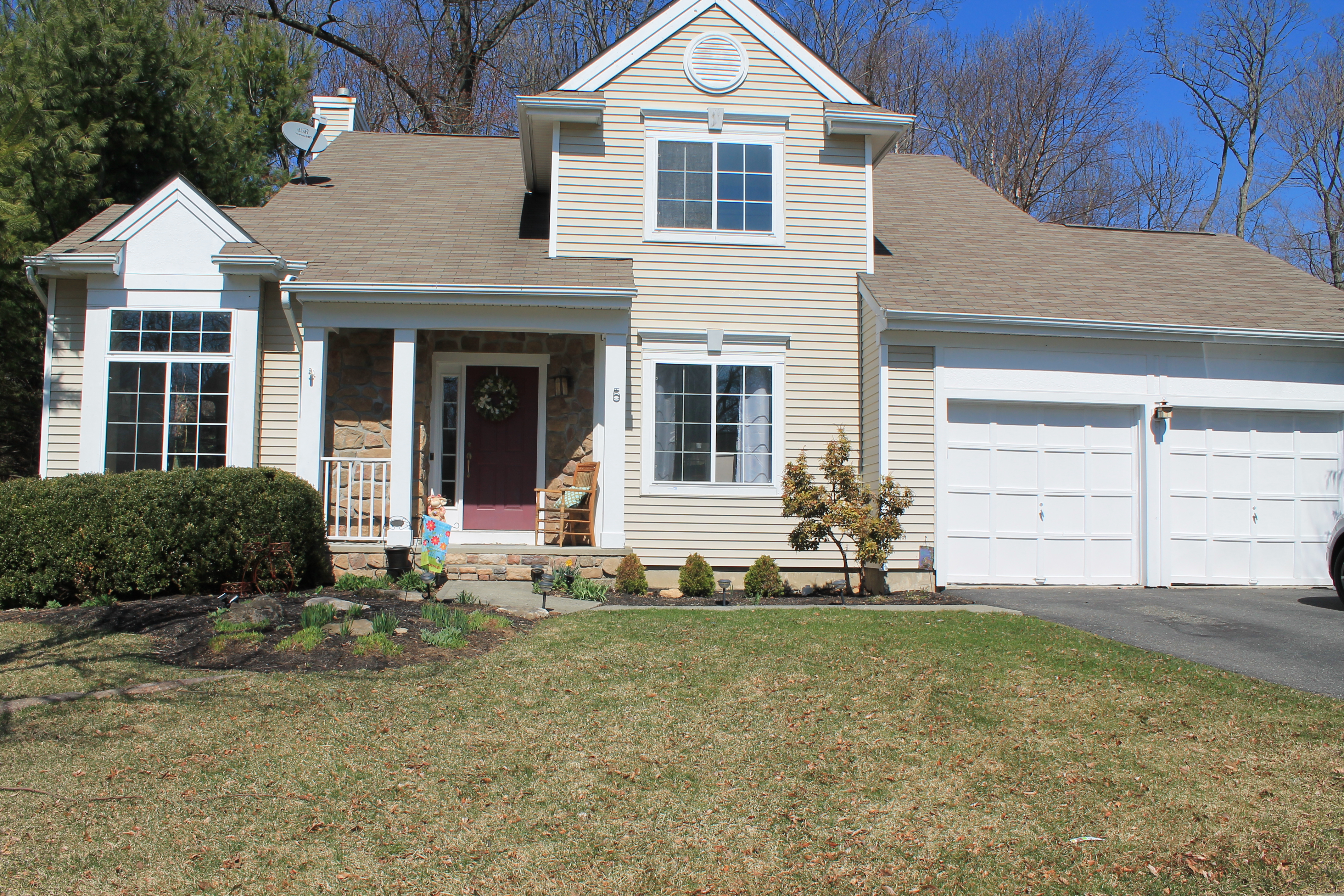
Originally, old blue paint was bleeding through and brass hardware was still hanging around from the 90s. This door was screaming “PLEASE, SOMEONE SHOW ME SOME LOVE!”

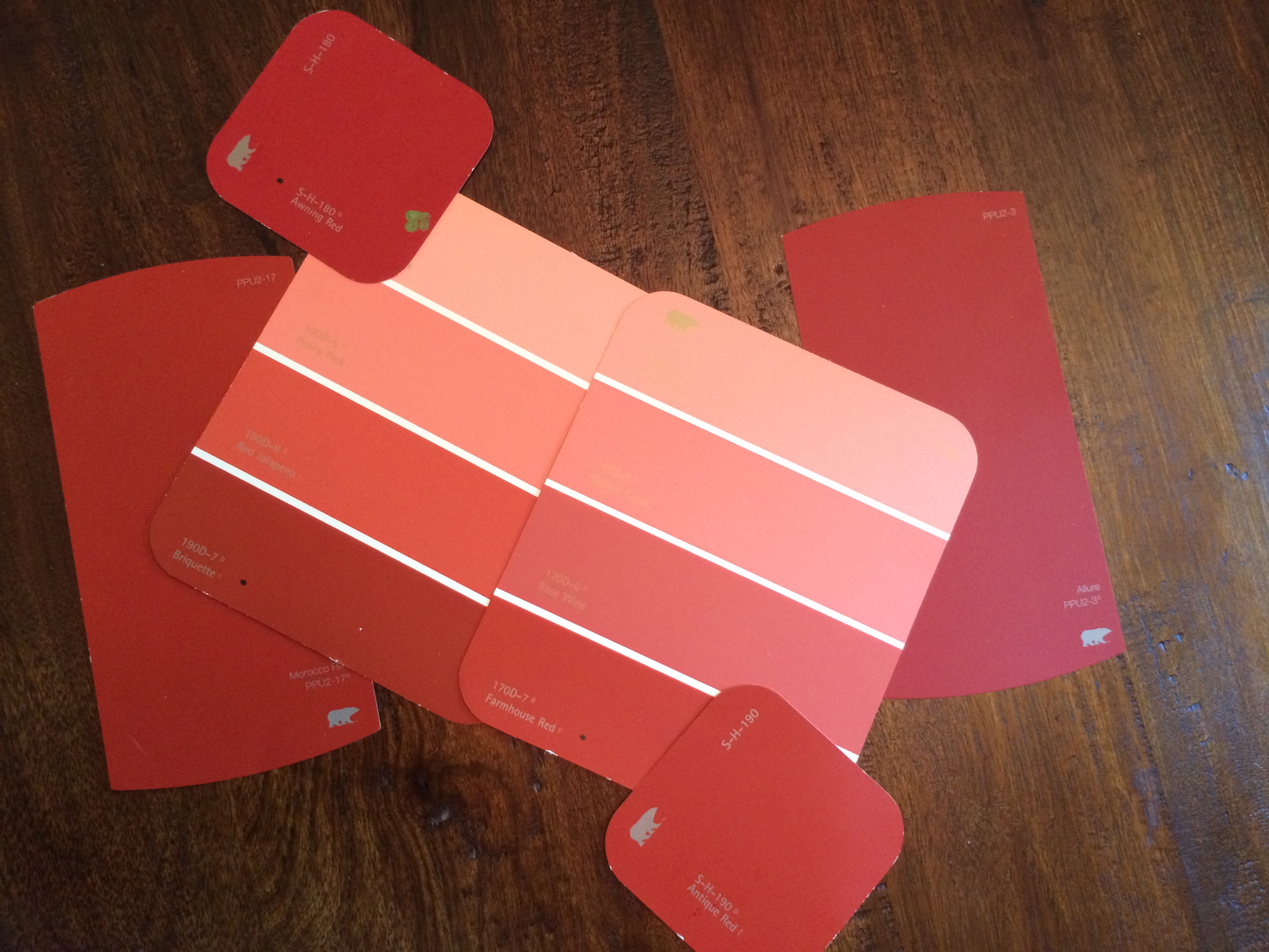
We’d always wanted a red front door, but choosing the right shade was more of an endeavor than we’d imagined it’d be. There were soooo many options! Don’t get me wrong, I am totally comfortable working with a color wheel and easily spot the difference between grey owl and grey dove. But red is one of those colors where I struggle!


After testing a few shades of red, we decided to go with Behr Marquee’s Awning Red. This paint was awesome!!! Typically, red is a really tough color to use and full coverage takes some work to accomplish. Well, I was able to cover the door in just 3 coats and didn’t even use the full quart of paint!

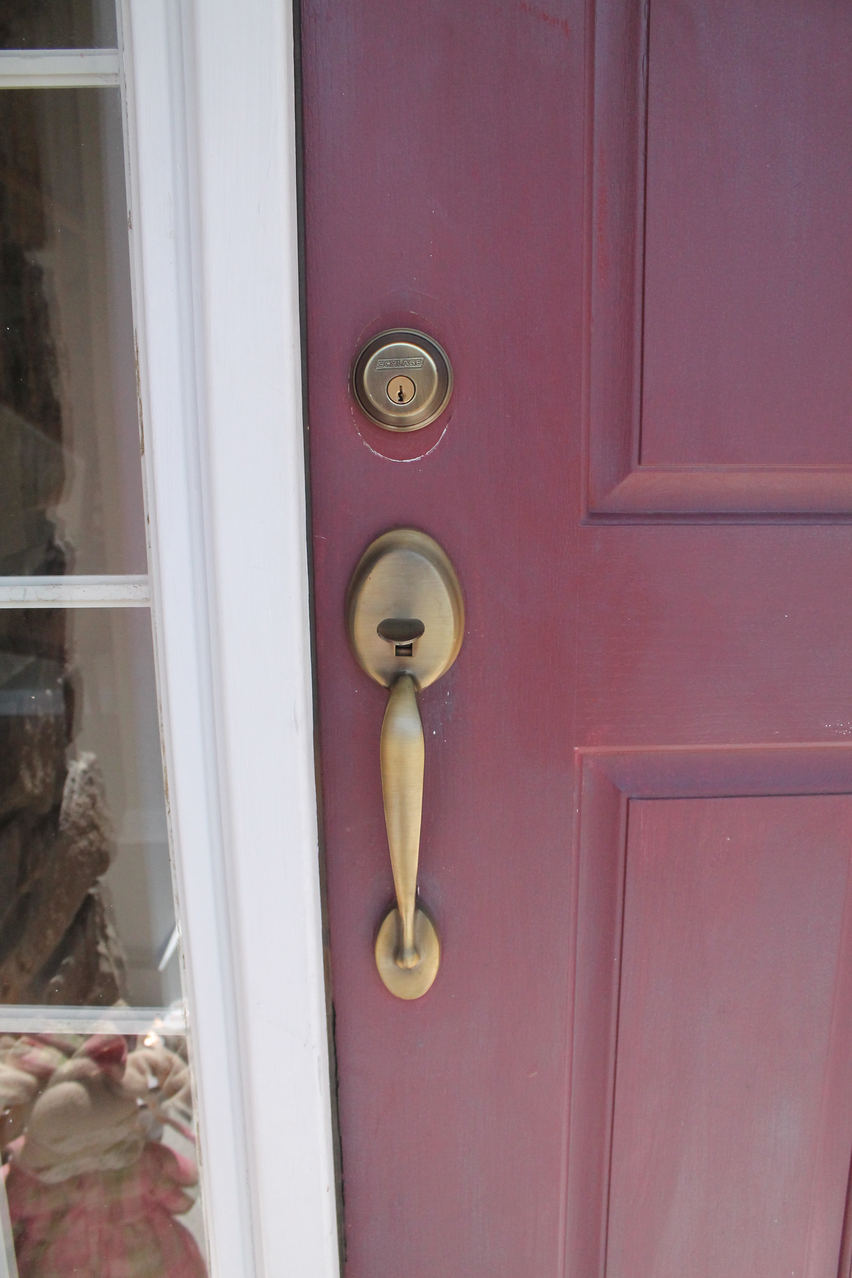
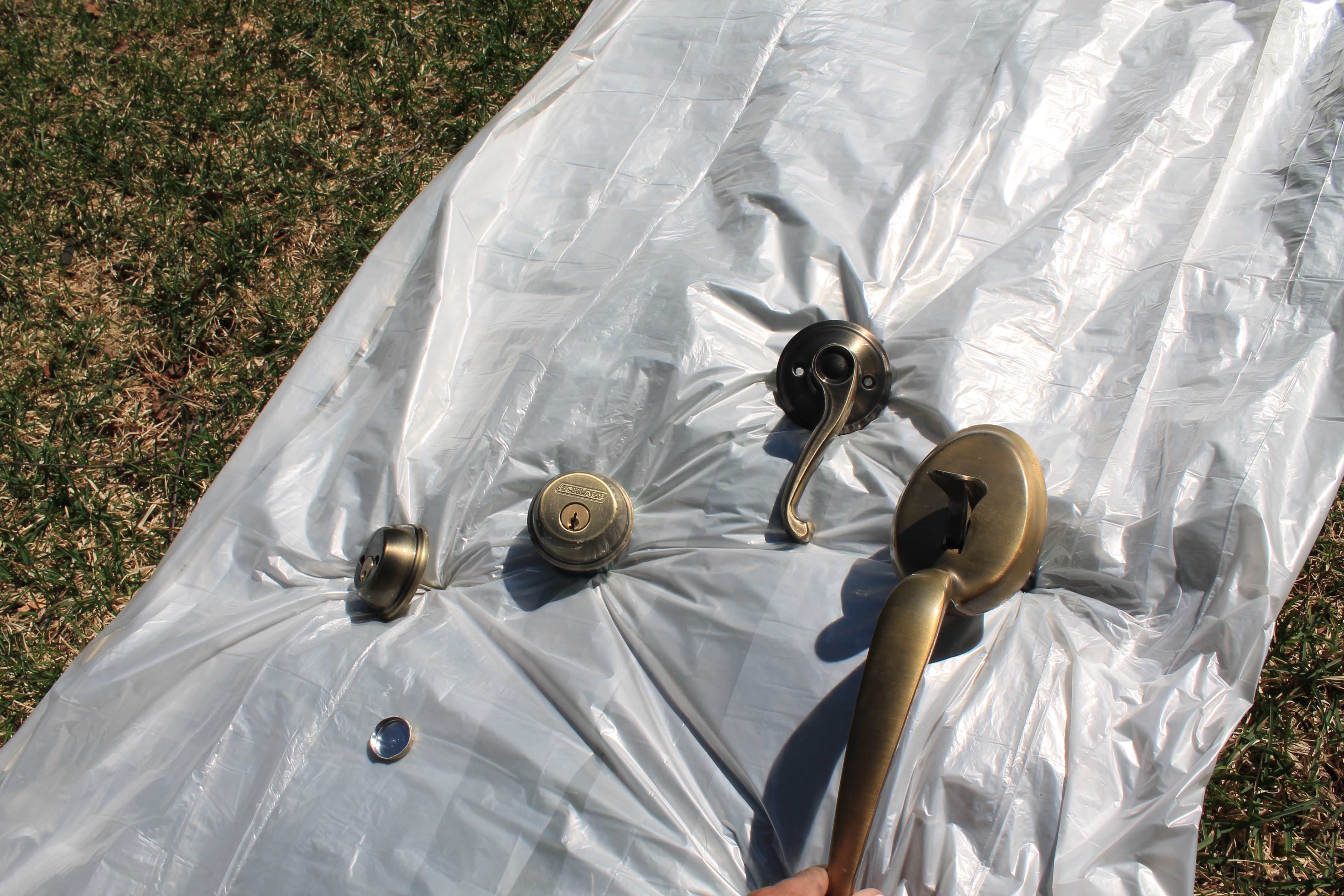
We also knew that we wanted to change the hardware. The brass just wasn’t doing it for us and we needed a new color to contrast against the red.

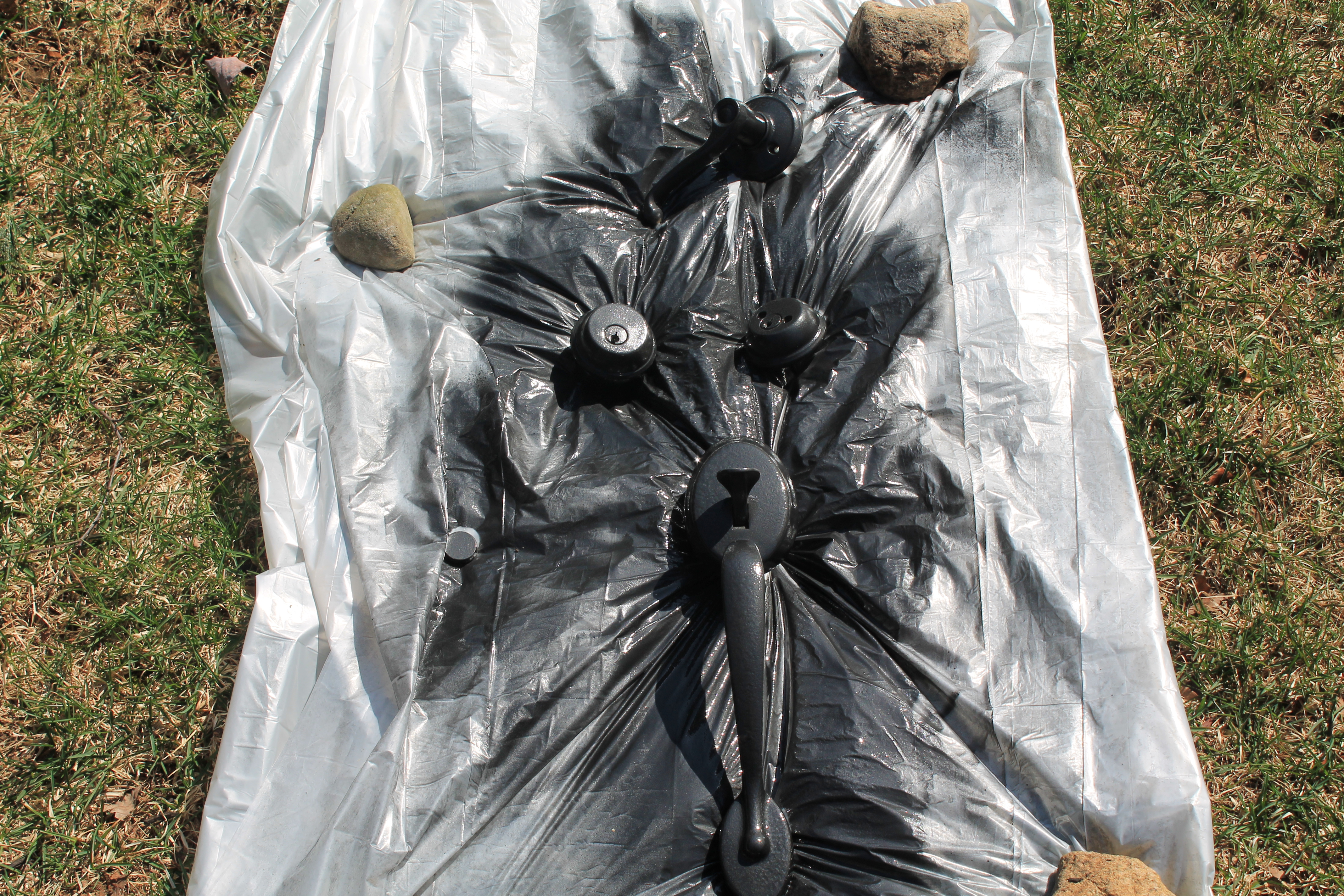
Since we are huge believers in using what we have, there was no need to run to Home Depot for a new lock and handle. We simply caught up with and old and dear friend of mine…spray paint!! Rust-oleum Universal is my absolute go to. Their Hammered Black Paint and Primer in One is an easy one step application which gives a unique hammered texture when applied.

I removed the hardware, found a sunny spot on our lawn, and got to work!


Ta da!! Welcome to 2014, Mr. Door Handle! Once they dried, I simply re-installed and the transformation was complete. Here’s another look at the final result:


Cost of this project:
1 Quart of Paint= $14.00
1 Can Spray Paint= $4.00
Total= $18.00
Not bad for a project that cost less than $20, huh? Now when I wonder what impression my neighbors have when they pass our house, the word that comes to mind is “inviting”! What word would you use?

Linked up at:
http://www.jenniferrizzo.com


![IMG_1597[1]](https://myknottedlife.com/wp-content/uploads/2014/05/img_15971.jpg)
![photo[1]](https://myknottedlife.com/wp-content/uploads/2014/05/photo1.jpg)
![photo_1[2]](https://myknottedlife.com/wp-content/uploads/2014/05/photo_12.jpg)